Design System
Every token, component and motion module on this site, pulled straight out of the code that renders it. Not a style guide written about the system -- the system itself, live.
Two grounds, five accents in rotation, and a darkened twin for every accent that has to carry text. Every value below is read off the DOM, not typed in. Click a swatch to copy it.
Ground
Light is not dark mirrored. It's a separate ramp with its own values.
Accent ramp
Five accents in rotation order, plus green, secondary and never a CTA color. Raw accents decorate: fills, glows, dots. The twin beneath each one carries text, because the raw accents fail contrast on paper.
Text tiers and lines
Three opacity steps for text, two hairline tiers for borders, and the chip pair. Each text step is raised on paper, because ink-on-white loses contrast faster than white-on-ink at the same alpha.
Three families, one job each: Greycliff for headings and the logo, Atkinson Next for body, Atkinson Mono for chrome.
Greycliff CF
Commercial, with no variable build, so each weight is its own file.
Developer. Designer. Diviner?
Developer. Designer. Diviner?
Developer. Designer. Diviner?
Atkinson Hyperlegible Next
Variable build, one file, 118KB for both Atkinsons. Body copy.
The quick brown fox jumps over the lazy dog, set at this site's 19px body size.
Why this face: the Braille Institute commissioned it from Applied Design Works for readers with low vision, tested against a panel of them. Every character is drawn to be told apart from its look-alikes. 1, I, l and i get distinct uprights, pairs like E/F and p/q are pulled apart, counters stay wide open, and spurs and tails are angled and lengthened. It wasn't designed for dyslexia, and I won't claim it was, but letters that look too much alike is a problem a lot of dyslexic readers describe too. That's why the whole site is set in it.
Atkinson Hyperlegible Mono
The same letterforms on a fixed width. UI chrome: nav labels, buttons, numerals.
const design = 'system'; // nav labels, buttons, numerals
Scale
Every step at its real size, largest first, with where it ships. Post and project bodies take their size from Typography's prose-lg and prose-xl instead, outside this ladder.
Chapter title
Chapter titles on About, service headings on HomeSection heading, h2
The About standfirst, section headings, the error pageSubheading, h3
Card titles on Work and Thoughts, career roles, Say helloSection lead paragraphs
Lead paragraphs on HomeSmall headings between body and lg
Role titles in the career story and About chaptersThis site's body copy, set at 19px
Body copy across Home and AboutButtons, nav links
PillButton, GlowButton, the navDim captions, org notes
Captions, org notes, the footerMono dates, meta
Dates, meta, small PillButtonsMono uppercase eyebrow
Eyebrows, the Seen Birds marqueeSmallest mono label
Image labels, tag chips, list numeralsRendered by the same code the rest of the site runs, in every variant each one ships with, then the source that put it there.
PillButton
Label left, disc right, glyph morphs, no colored fills by rule.
|
|
|
GlowWrap
A bloom on hover or focus of whatever it wraps, in the wrapped thing's own color. A smaller relative of the hero's edge glow, no pointer tracking.
Special buttons
The two calls to action that get more than a PillButton. GlowButton splits its label per character and lifts each one toward the cursor; NavCta turns pink and blooms as one piece.
|
|
|
DotHeading / PostHeading
Two components on purpose: one runs a full-bleed row, the other a single column, and both share the same dot-wave-on-scroll.
A thought, titled
|
|
|
|
|
|
|
Crosshatch
WebGL2 with a CSS fallback. Palette read from the tokens, line color inherited from --ink-strong, every prop read once at mount.
|
NotchedImage
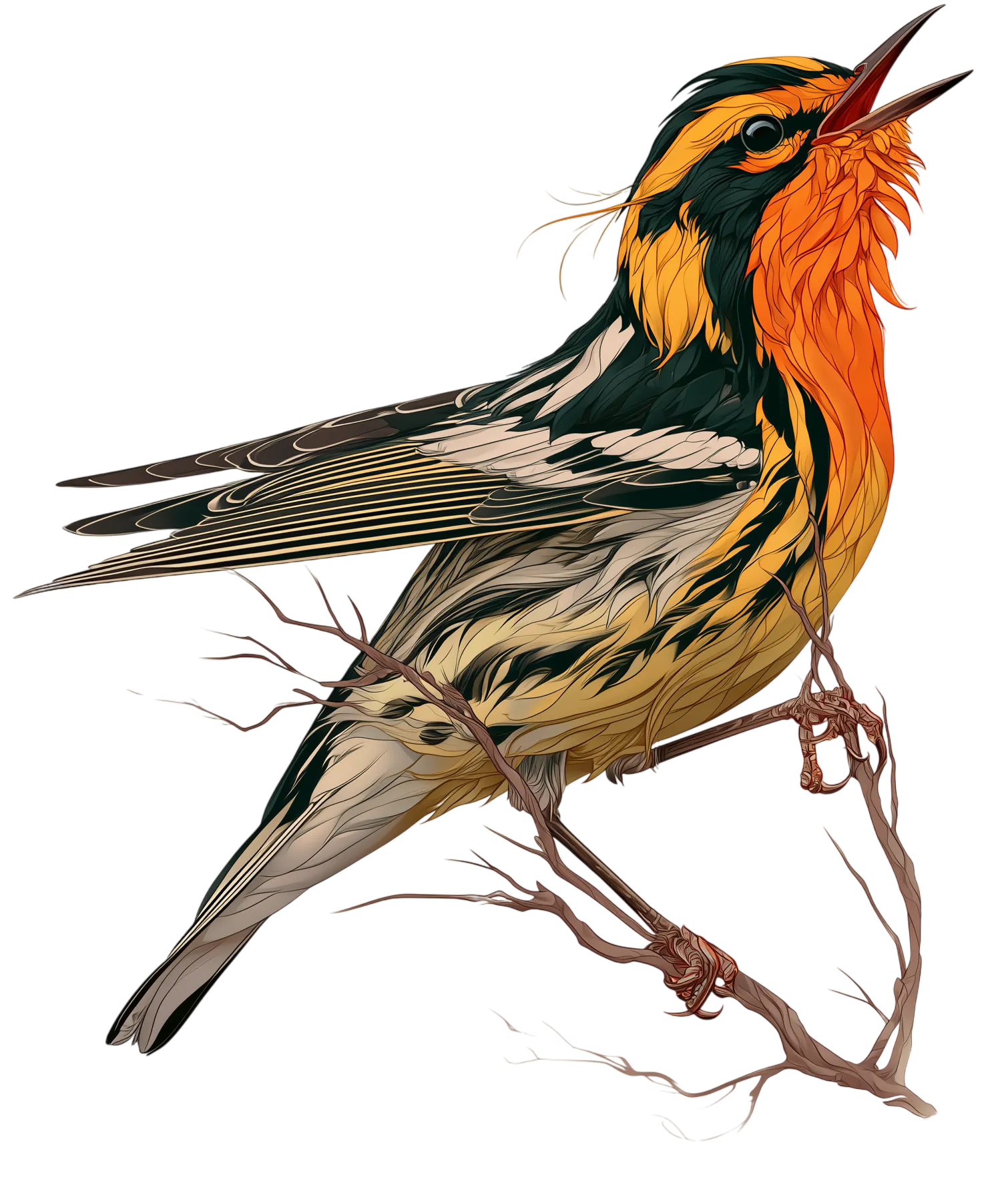
A clip-path bite on a live img, not a flattened export -- swap the image and the shape holds. The infill triangle is a Crosshatch.
|
ContactCard
Brand hexes are the platforms' own, intentionally outside the token set.
|
|
|
|
|
|
|
|
|
|
|
|
|
The Hero, Seen Birds and the service rail are on the homepage; Nav and SiteFooter are already on this page.
One class, no props. Components don't know which ground they're on, and never needed to.
.light is a plain class that redefines the semantic tokens; custom properties
inherit, so everything below it follows. There's no toggle, no attribute on <html>, no persistence -- the light theme is real and fully built, but
no page on the site uses it, so this is the only place it exists. There are two ways to
reach for it, shown below.
ThemeSection
For a whole band. Full-bleed, so the wrong ground never shows at the sides on a wide screen. PageSection's theme prop wraps itself in one.
The same section, on ink
Nothing inside was told which theme it's in.
The same section, on paper
Nothing inside was told which theme it's in.
|
|
|
|
|
Take it if you need it for a talk, a post or a podcast page.
Logo
One for dark grounds, one for paper. The paper version swaps white for ink, darkens the blue and coral the way the accent ramp does, and carries a hair more weight, since dark shapes on a light ground read thinner than the same shapes reversed.